Brief:
Al, Renee Walts and myself settled a simple, heartfelt mission: create a brand identity that reflects their deep connection to their land and community. As lifelong Mainers and experienced small-scale farmers, they wanted to share their knowledge and services—ranging from agricultural consulting to homesteading guidance—with neighbors and like-minded individuals in their area.
Their request was clear: something warm, grounded, and reflective of the place they call home.
Their request was clear: something warm, grounded, and reflective of the place they call home.
_

Process
_
Discovery
I began by diving into Al and Renee’s story—how they built their farm from the ground up, the kinds of services they offer, and what values guide their work. Integrity, sustainability, and community all emerged as core themes.
Equally important was the location: Maine, a state known for its breathtaking forests, rugged coastlines, and resilient people. This sense of place became a key design driver.
Naming & Positioning
I chose to use their full names—Al & Renee Walts Consulting—to keep the brand personal and approachable. This decision reflects the nature of their work: one-on-one, grounded, and relational.
Visual Inspiration
The natural landscape of Maine was the primary source of visual inspiration—particularly the dense forests that surround their farm. The concept of growth, roots, and sustainability was translated into a minimal, line-based identity system.
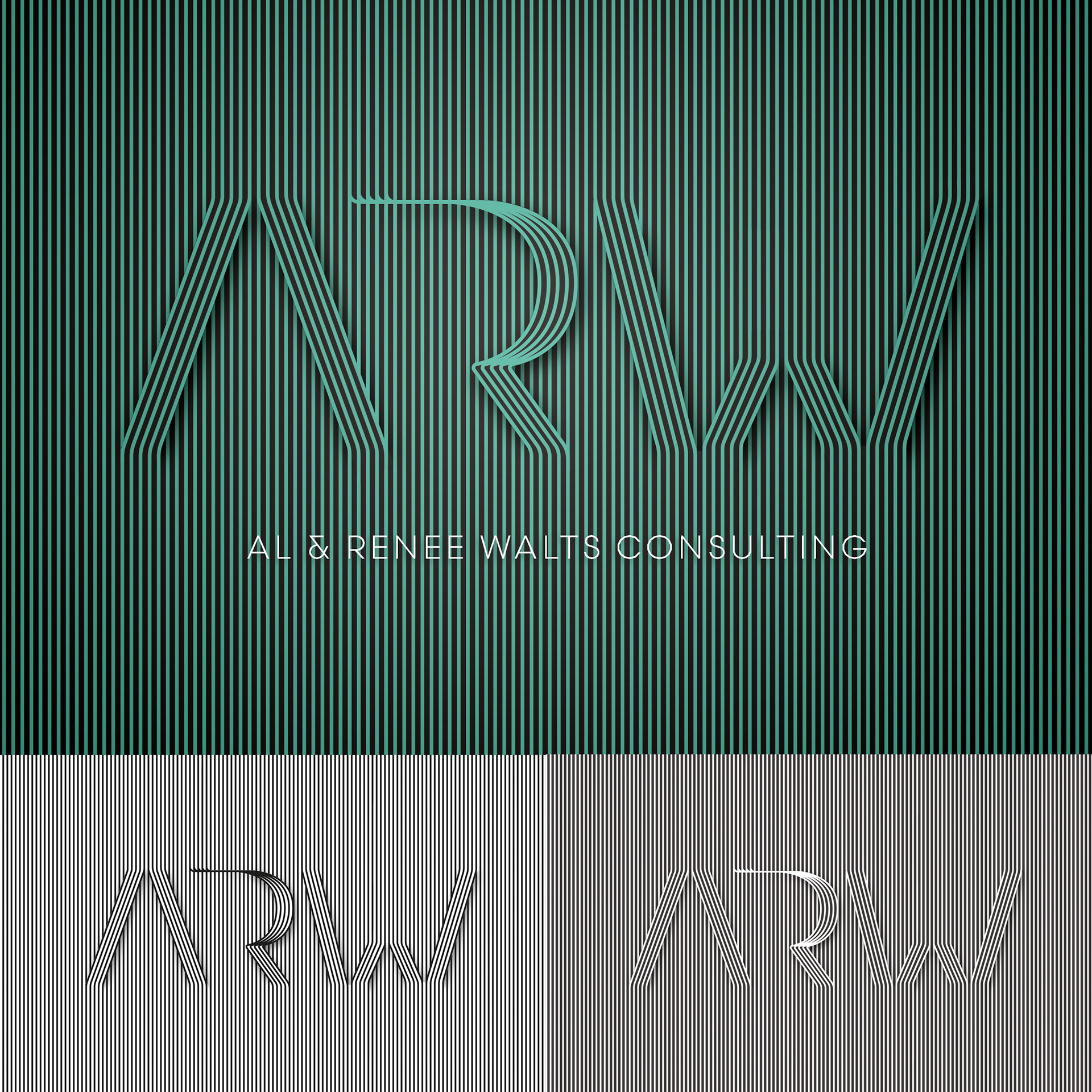
Logo Design
The logo is a simple, elegant line illustration that subtly references the vertical rhythm of trees, evoking both nature and structure—mirroring the balance between organic growth and the thoughtful planning Al and Renee offer their clients.
Color Palette
I developed a muted, earthy palette drawn from Maine’s environment: rich greens, bold greys, and muted white. This palette feels organic and trustworthy, anchoring the brand in its natural setting.
Typography
A clean, sans-serif typeface was selected to communicate clarity, professionalism, and a focus on modern sustainability practices. Paired with the minimalist logo, the typography ensures that the brand remains timeless and legible across all uses.
Outcome
The final identity captures the essence of Al and Renee’s mission: to serve their community with wisdom rooted in experience and a deep love of the land. With a brand that feels both humble and refined, they are now equipped to confidently present their services to a wider audience—without losing the personal touch that sets them apart.
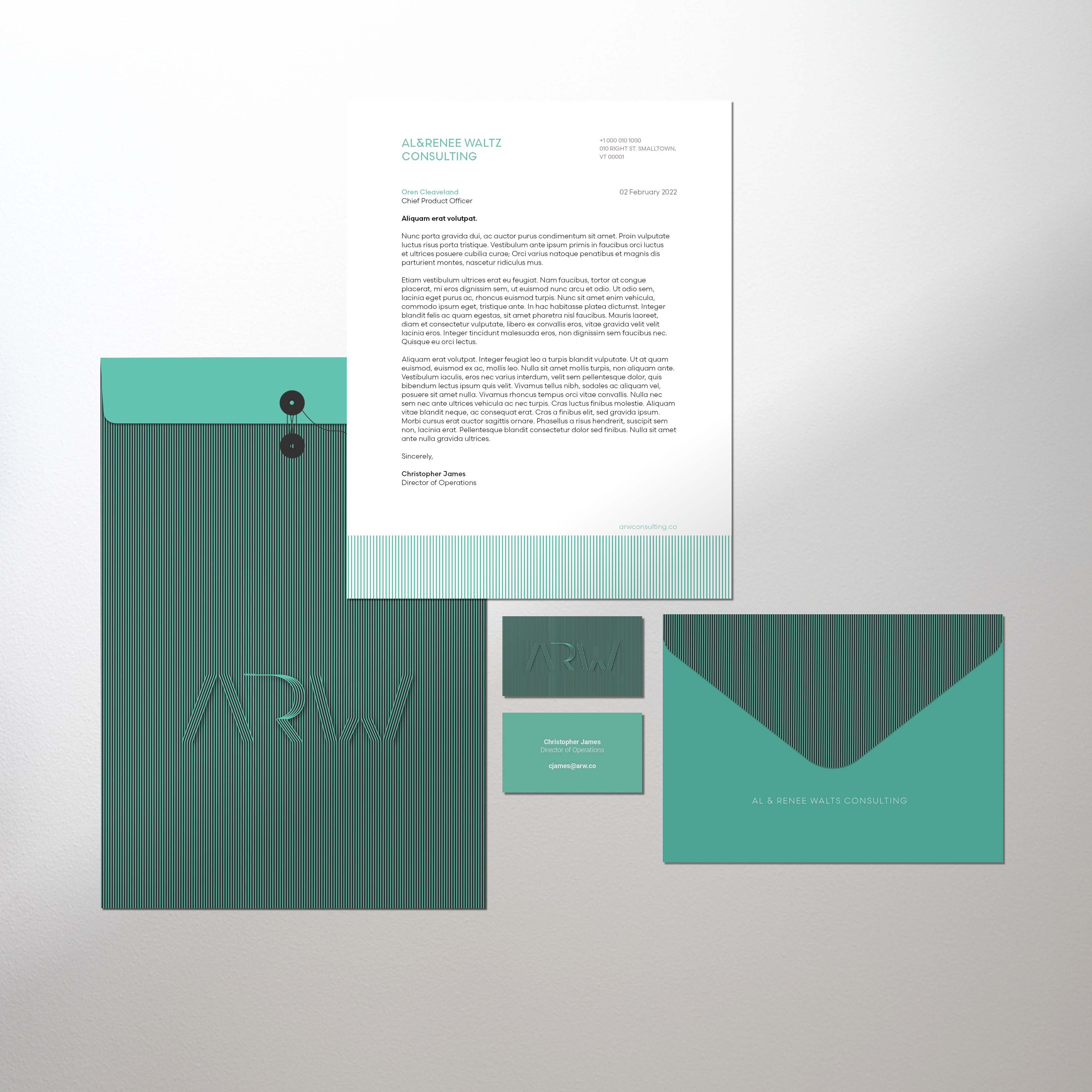
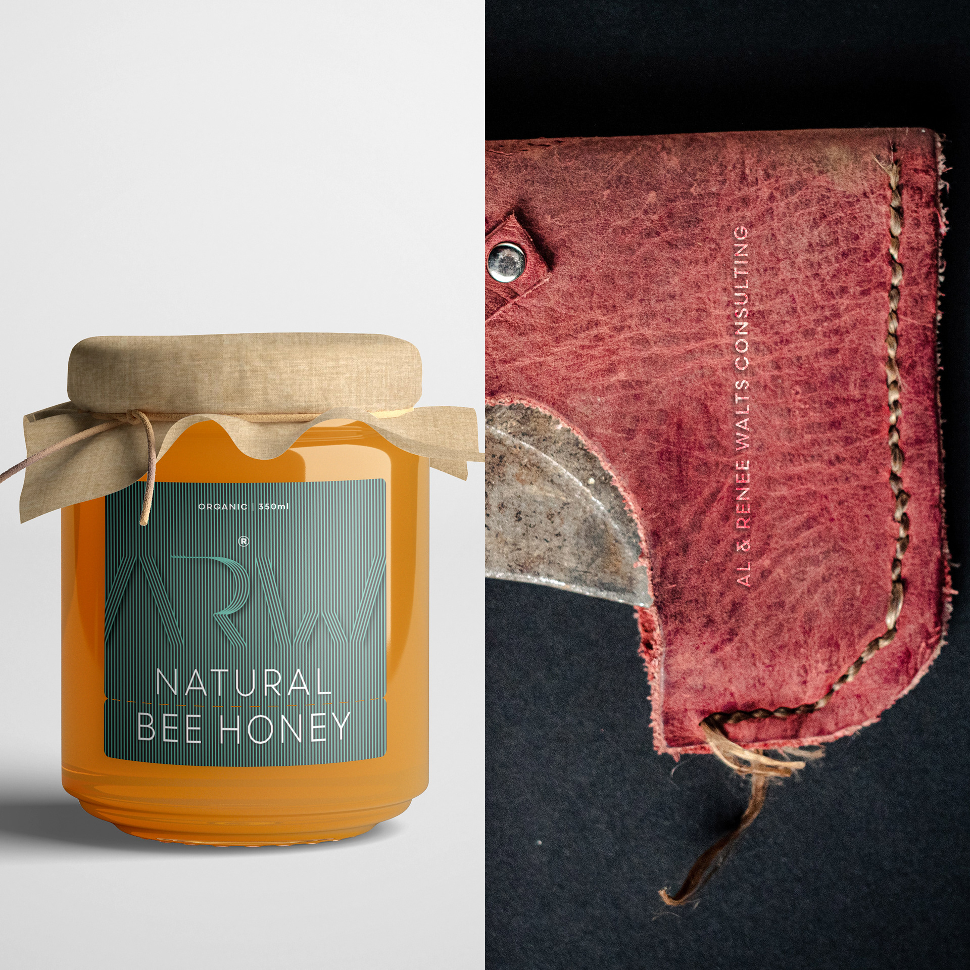
Deliverables
Logo Suite (Primary, Secondary, Icon)
Color Palette & Typography Guidelines
Business Cards
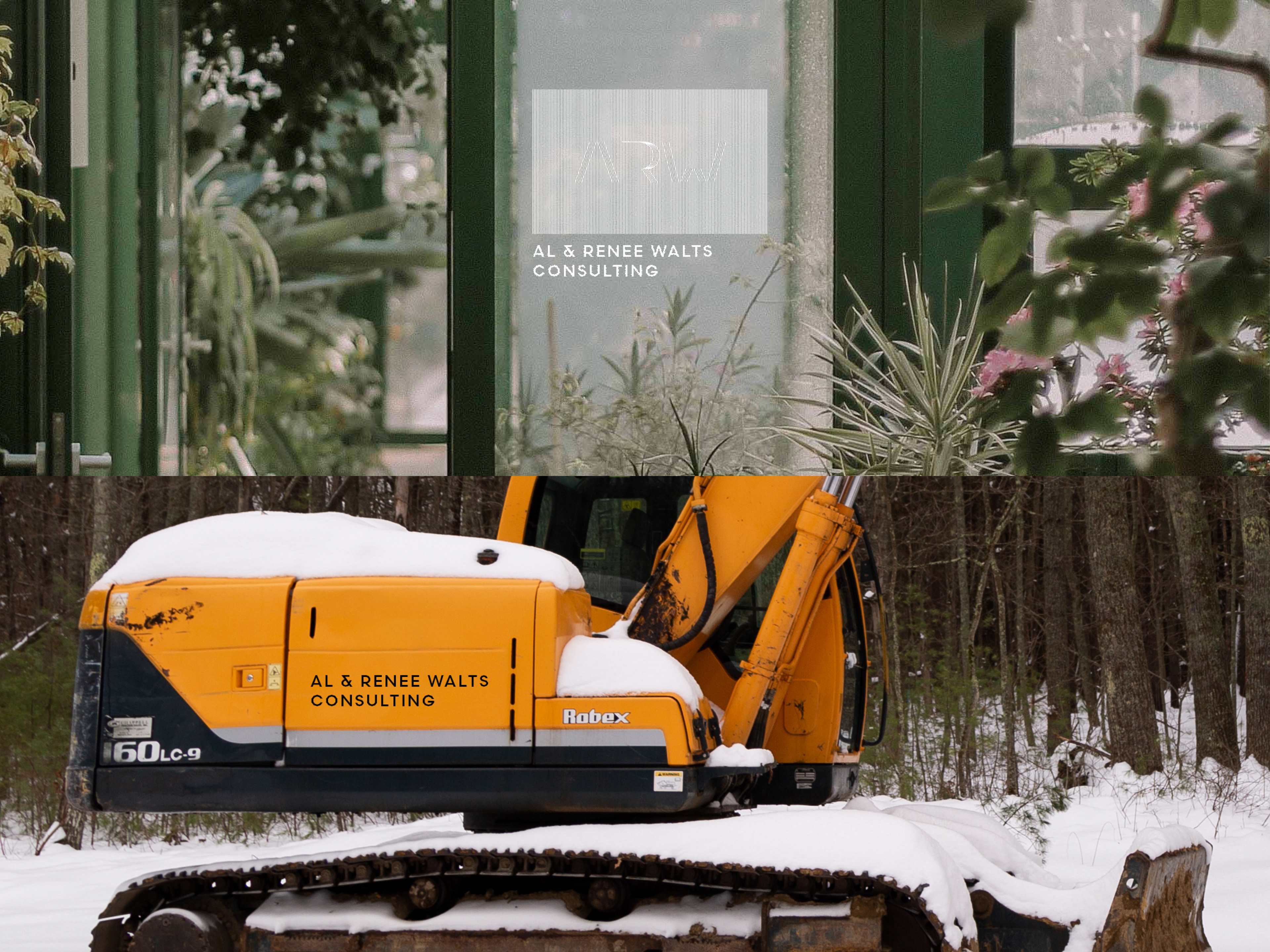
Equipment Decals
Branded Templates (flyers, invoices, consultation forms)
Al & Renee Walts Consulting is more than a name—it’s a promise of care, connection, and cultivation. This brand honors that promise, with every line and color rooted in the soil they call home.