Brief
Background
Newport Brewing is a small craft brewery rooted in the forested town of Newport, WA. Known for its local charm and adventurous brews, the brand wanted to modernize its identity while launching a new flagship beer: Juniper Pale Ale — a crisp, aromatic IPA inspired by the evergreen-rich landscape of the Pacific Northwest.
This was a passion-driven collaboration that aimed to reflect both the natural beauty of Newport and the brewery’s evolution into a more refined, recognizable local brand.
The Challenge
The project called for a refresh of the Newport Brewing logo to better align with current design trends and appeal to a broader craft beer audience — without losing the brewery's rugged, forest-town authenticity.
Simultaneously, we needed to develop packaging for Juniper Pale Ale that:
- Embodied the spirit of the Pacific Northwest
- Stood out on shelves
- Reinforced the brewery’s connection to place, nature, and bold, clean flavor
_
Process
Inspiration
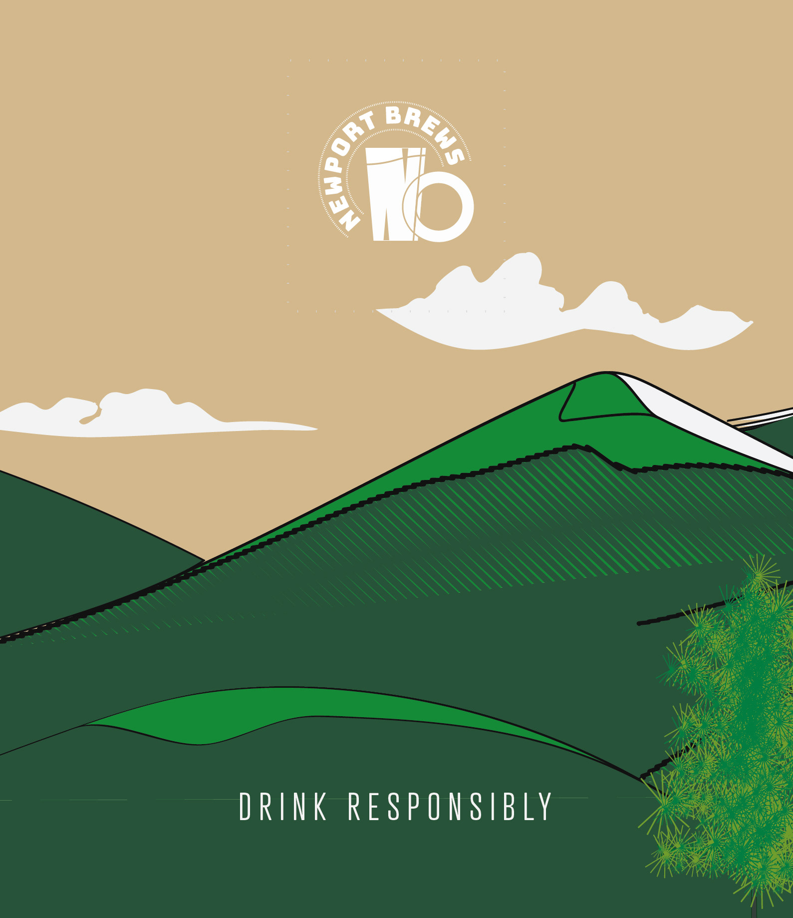
The primary inspiration came from the dense forests and high-desert terrain surrounding Newport. Juniper, pine, cedar — these trees are more than just scenery; they’re symbols of endurance, freshness, and wildness. The idea was to create a visual identity that breathed in the landscape and exhaled a brand that was rooted, refreshing, and adventurous.
Deliverables
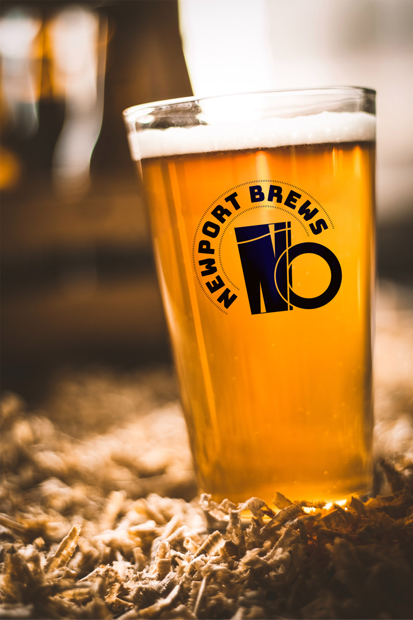
- Modernized Logo for Newport Brewing
- 12 oz Bottle Label Design for Juniper Pale Ale
- Box Packaging Design (6-pack or 12-pack)
Design Approach
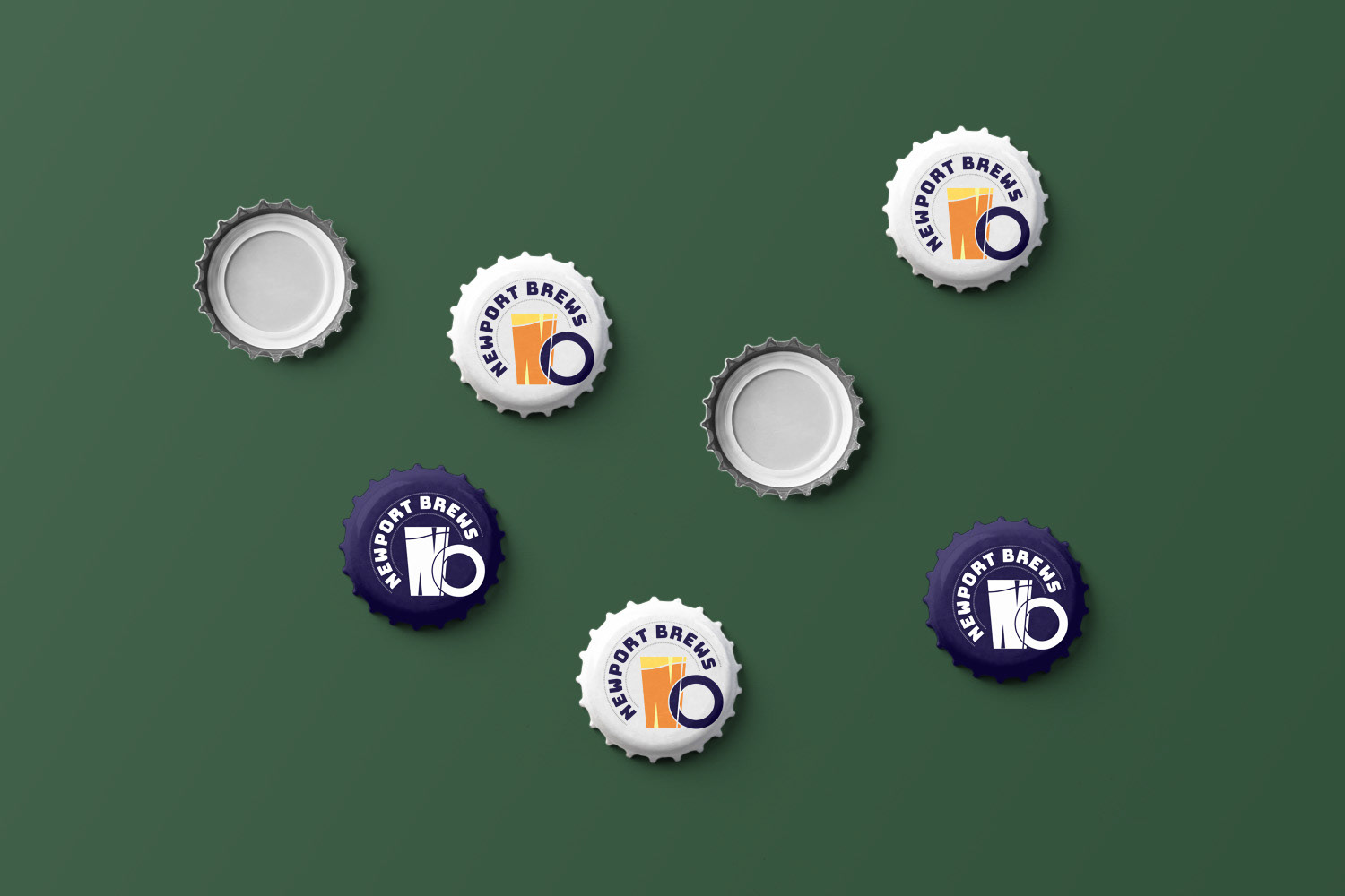
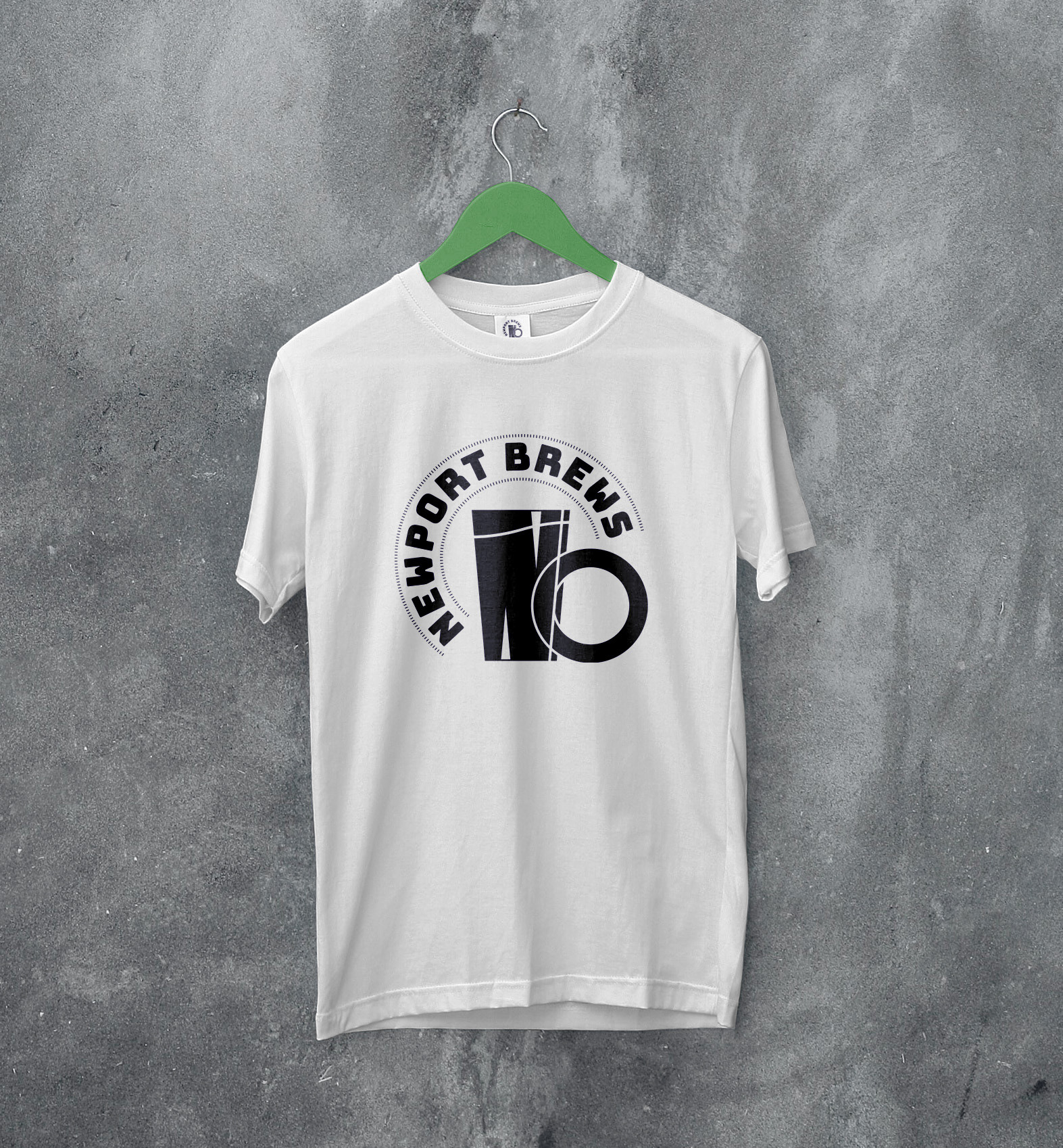
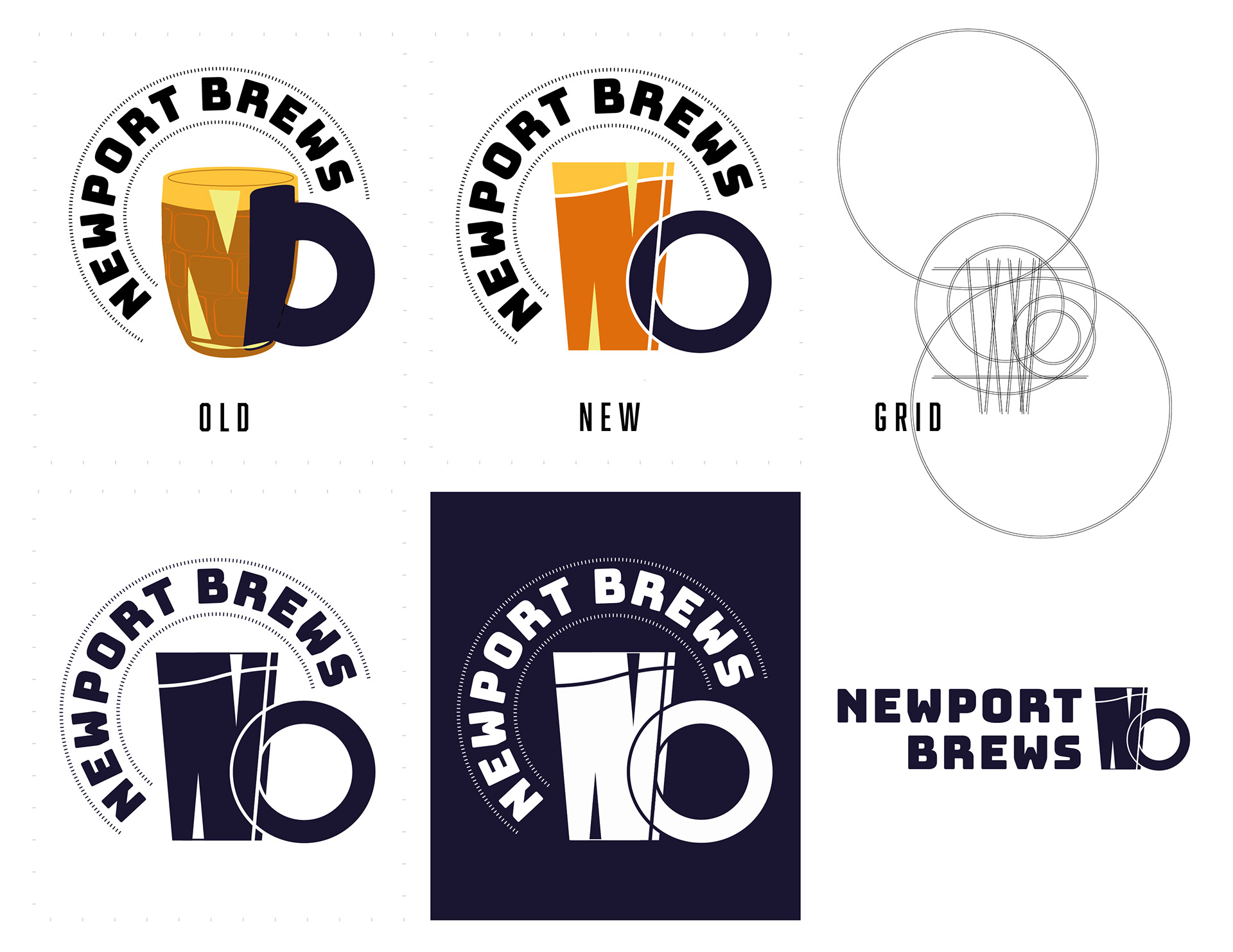
The new logo retains the beer pint motif from the original, but in a simplified, geometric form with cleaner typography forming the letter "N" for Newport. The logotype uses a bold sans serif font with subtle customizations for memorability and strength. The new mark feels both modern and organic — just like the beer.
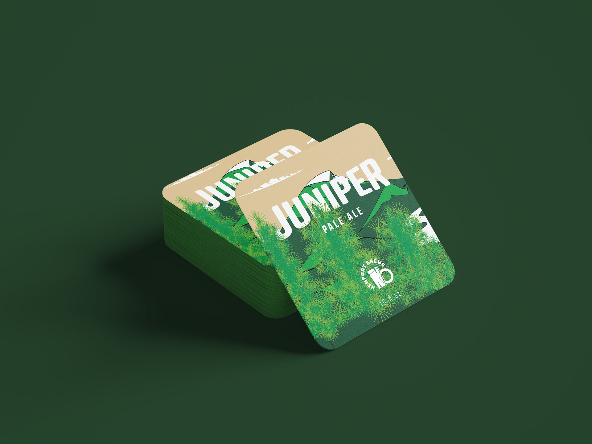
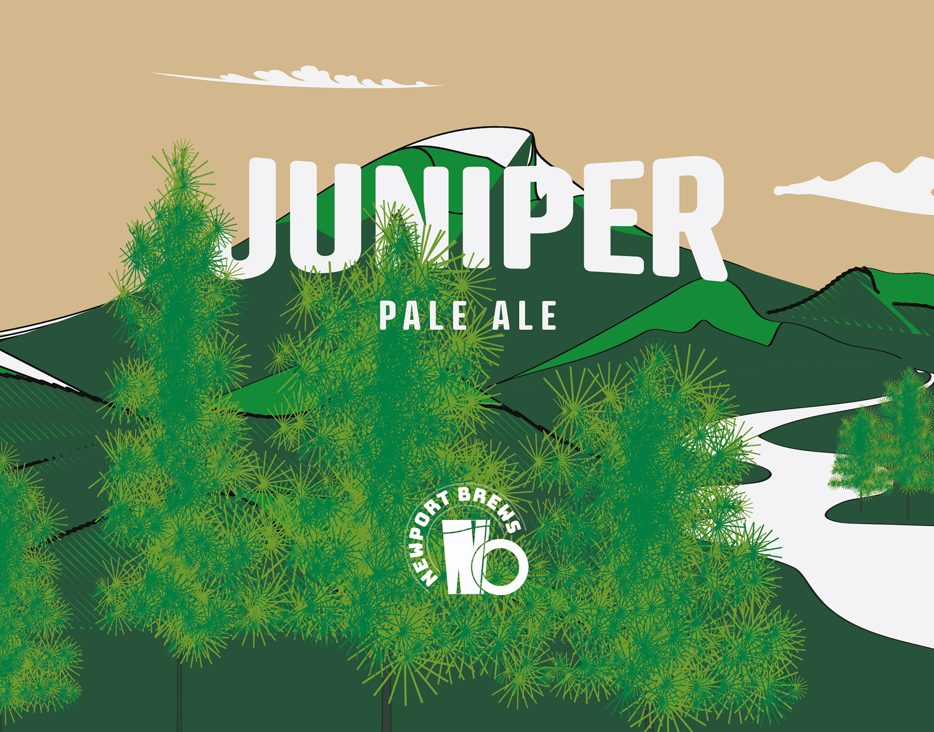
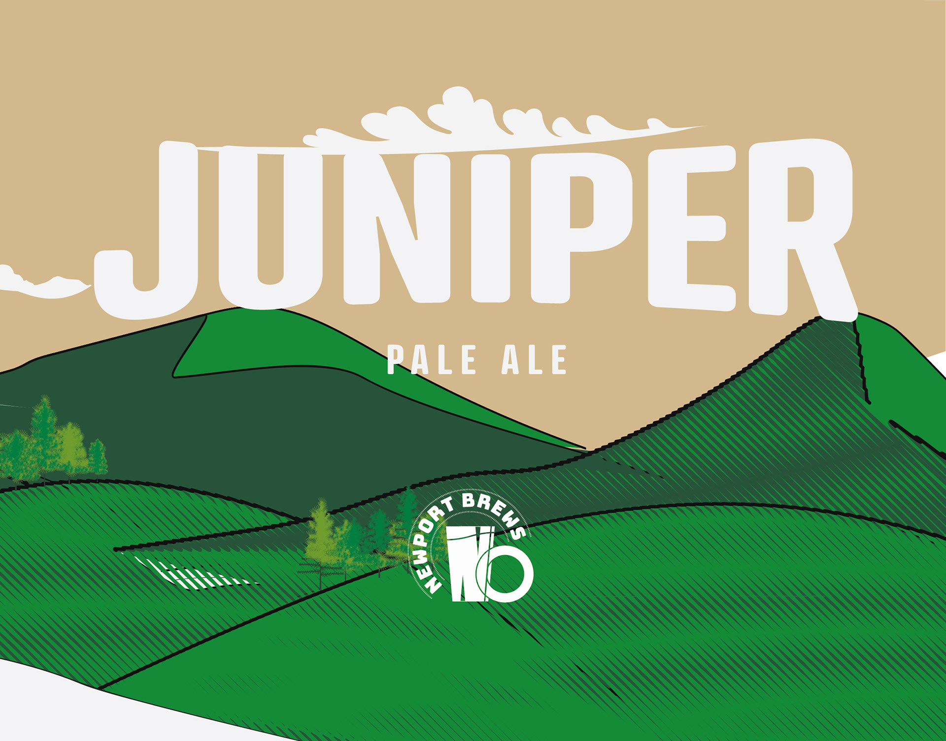
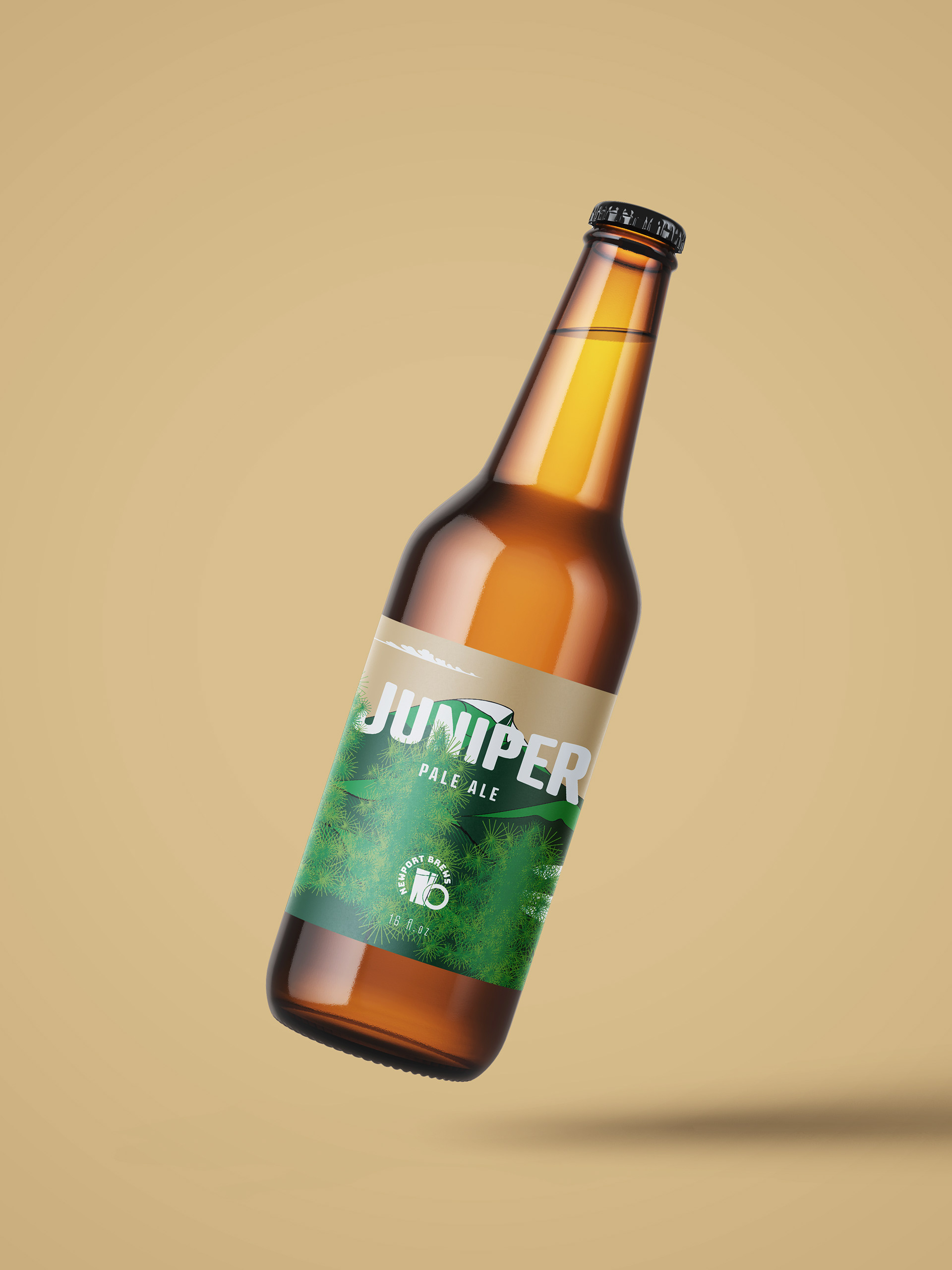
Juniper Pale Ale label design
The design features—
A stylized juniper forest illustration wrapping around the bottle
Earthy but clean colors — forest green, creamy khaki, and off-white
A subtly textured background evoking pine bark or misted glass
Crisp, clear type hierarchy with the beer’s name front and center
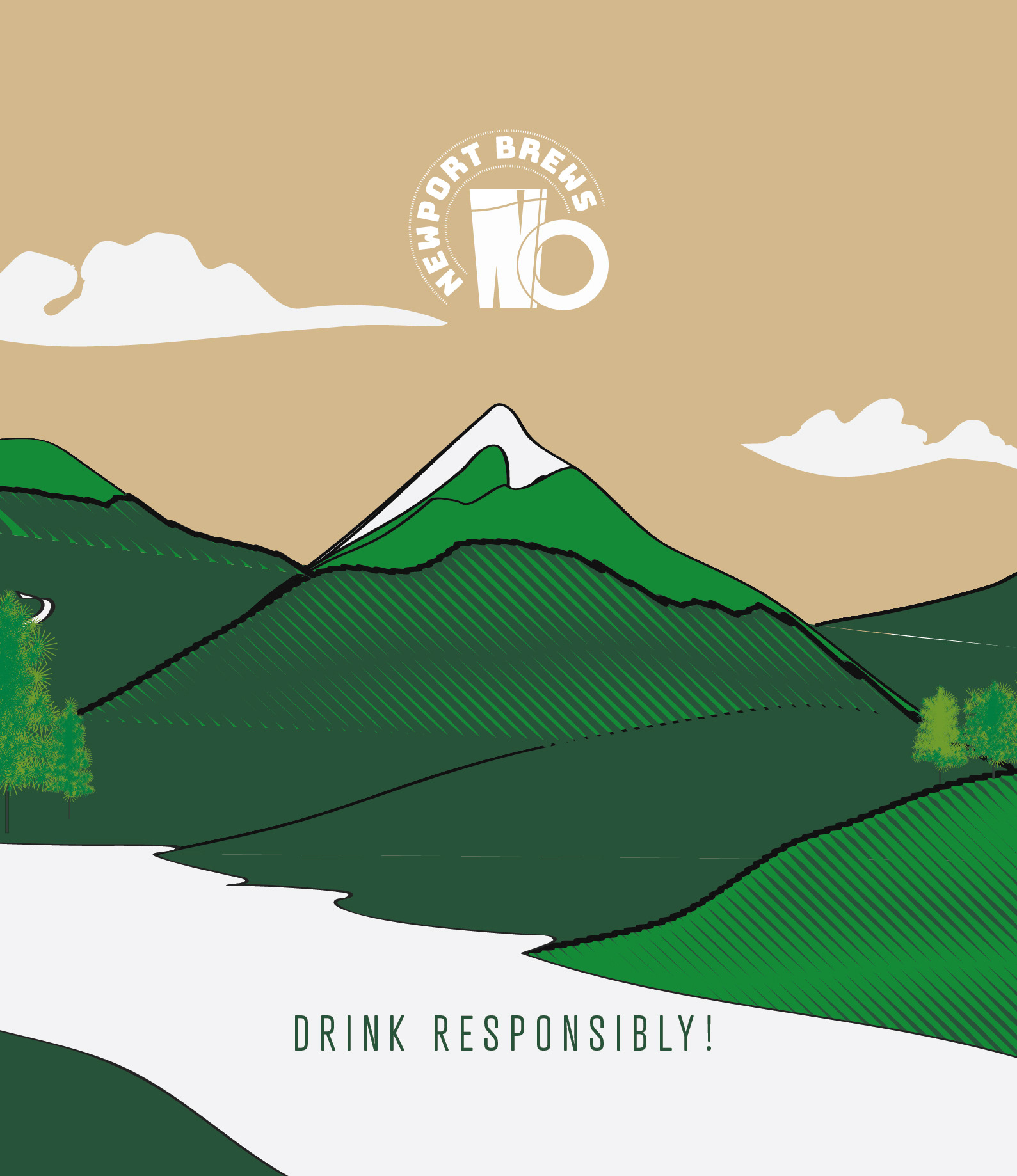
The box packaging continues the story with full-bleed nature illustrations, creating a shelf presence that’s rugged, refined, and unmistakably Pacific Northwest.
The updated brand and packaging gave Newport Brewing a sharper visual identity while maintaining its local heart. The Juniper Pale Ale packaging became a talking point for customers and bar owners alike — it looked great on the shelf, in-hand, and on social media.