Brief
_
Brand assets for a new and exciting tourism guide for Beijing, China.
The brand must integrate the cultural wealth of China's capital with the modern activities and opportunities available to all demographics.
The brand must integrate the cultural wealth of China's capital with the modern activities and opportunities available to all demographics.
_

Process
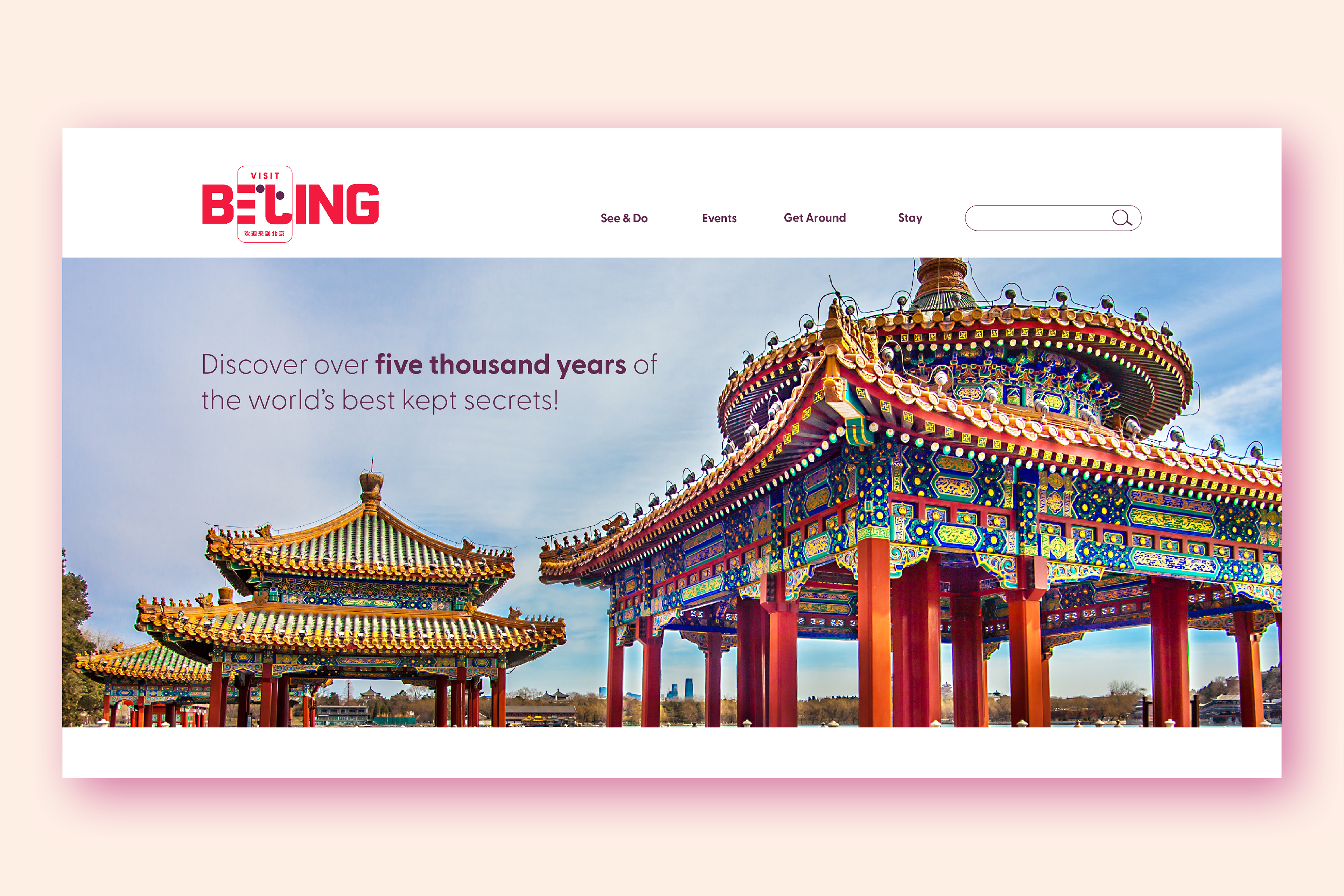
This is one of the more interesting projects I've had the privilege of working on. Having spent years living in Beijing, I drew a lot of inspiration from the many opportunities I had to explore and experience all the city had to offer. Combining a day hike to the Great Wall followed by a mouth-watering dinner at a beautiful restaurant in downtown Sanlitun was always an unforgettable experience. I wanted to capture that and countless other experiences in this brand design.
One of many interesting challenges when designing across cultures is the additional knowledge and research required to create a product that communicates a clear message to people of all backgrounds.
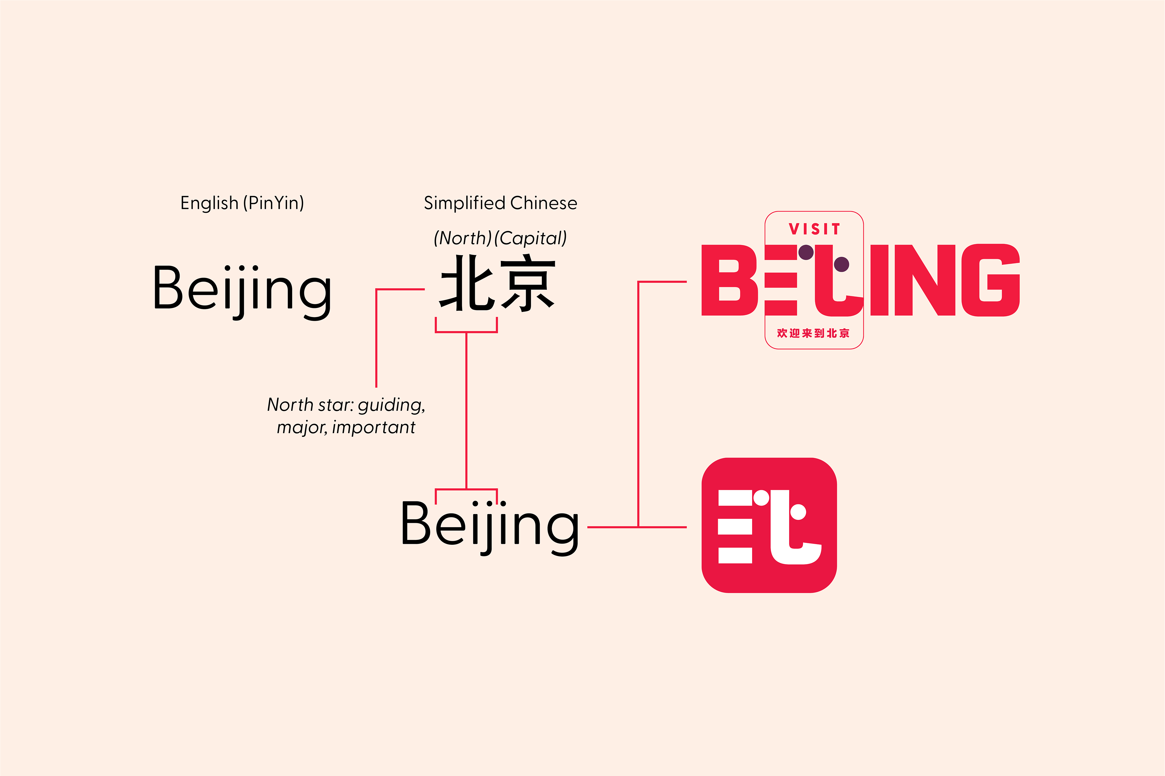
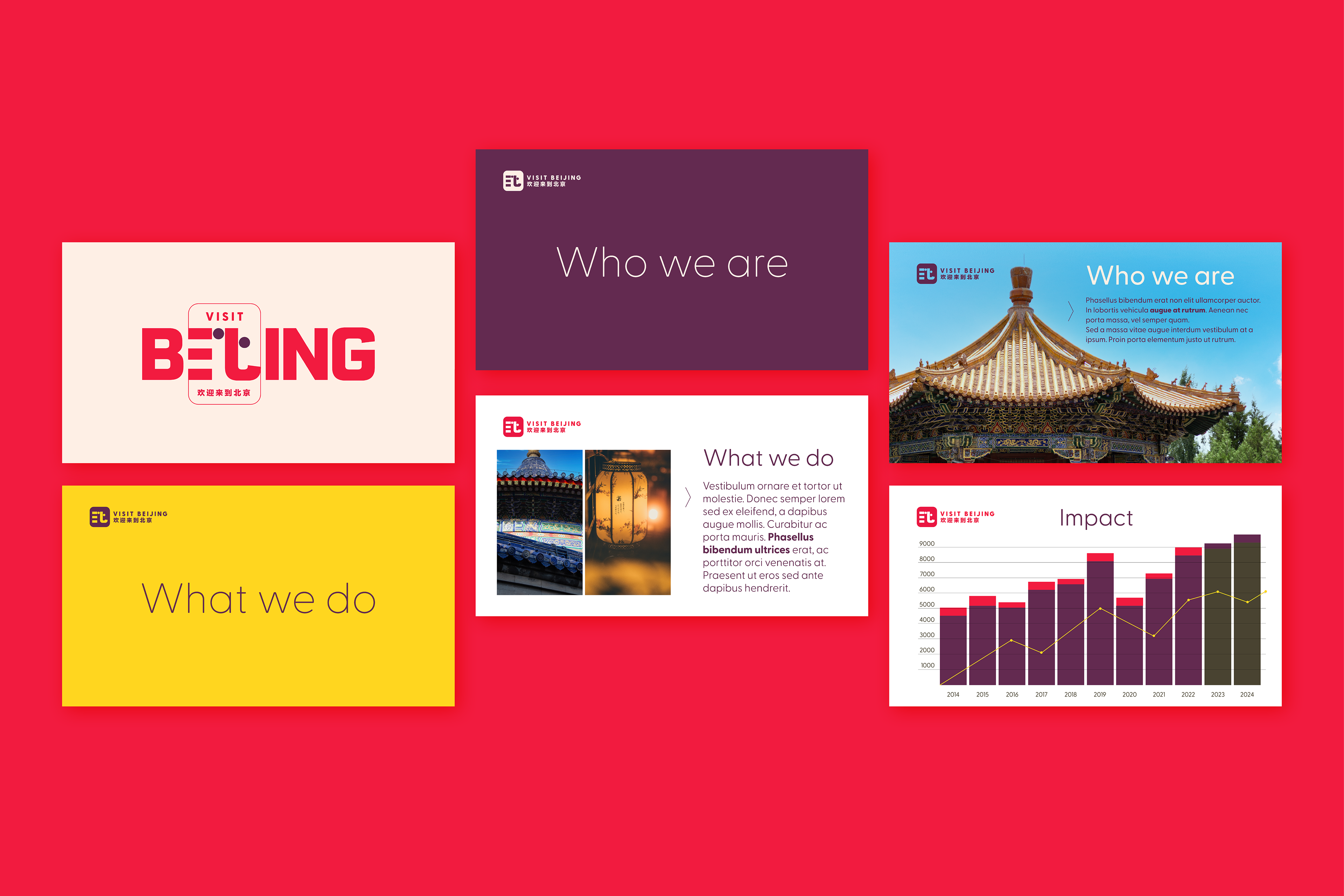
For example, selecting the color red addresses the prominence and importance of the color in Chinese culture. It symbolized luck, joy, and happiness. At the same time, it speaks of passion and excitement in color psychology. This powerful combination serves the brand better than many other choices would have.
Sketches I already had of traditional Chinese architecture, combined with advanced knowledge of Chinese written characters, were critical in creating the iconic logo for the brand. I used photographs I took myself, which tied the style together well while staying true to the brand message.